JavaFX 布局面板
最后修改于 2023 年 10 月 18 日
本 JavaFX 教程部分涵盖了节点的布局管理。我们提到了这些布局面板:FlowPane、HBox、BorderPane、AnchorPane、GridPane 和 MigPane。此外,我们还展示了如何使用 Pane 在绝对坐标中定位节点。
布局面板 是容器,用于在 JavaFX 应用程序的场景图中灵活且动态地排列 UI 控件。当窗口调整大小时,布局面板会自动重新定位和调整其包含的节点的大小。
JavaFX 具有以下内置的布局面板
FlowPane– 以流的形式布局其子节点,并在 flowpane 的边界处换行。HBox– 将其内容节点水平排列在单行中。VBox– 将其内容节点垂直排列在单列中。AnchorPane– 将节点锚定到面板的顶部、底部、左侧或中心。BorderPane– 将其内容节点布局在顶部、底部、右侧、左侧或中心区域。StackPane– 将其内容节点放置在从后到前的单个堆栈中。TilePane– 将其内容节点放置在大小均匀的布局单元格或瓦片中。GridPane– 将其内容节点放置在行和列的网格中。
为了创建更复杂的布局,可以在 JavaFX 应用程序中嵌套不同的容器。除了 GridPane 之外,内置的布局管理器都非常基础,不适用于更复杂的应用程序。更复杂的布局应使用 GridPane 或第三方 MigPane。
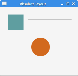
绝对布局
Pane 节点可用于在绝对坐标中定位节点。复杂的布局应该始终使用布局管理器创建;绝对布局用于特定情况(例如,定位图表或图像)。
package com.zetcode;

import javafx.application.Application;
import javafx.scene.Scene;
import javafx.scene.layout.Pane;
import javafx.scene.paint.Color;
import javafx.scene.shape.Circle;
import javafx.scene.shape.Line;
import javafx.scene.shape.Rectangle;
import javafx.stage.Stage;


public class AbsoluteLayoutEx extends Application {

    @Override
    public void start(Stage stage) {

        initUI(stage);
    }

    private void initUI(Stage stage) {

        Pane root = new Pane();

        Rectangle rect = new Rectangle(25, 25, 50, 50);
        rect.setFill(Color.CADETBLUE);

        Line line = new Line(90, 40, 230, 40);
        line.setStroke(Color.BLACK);

        Circle circle = new Circle(130, 130, 30);
        circle.setFill(Color.CHOCOLATE);

        root.getChildren().addAll(rect, line, circle);

        Scene scene = new Scene(root, 250, 220, Color.WHITESMOKE);

        stage.setTitle("Absolute layout");
        stage.setScene(scene);
        stage.show();
    }

    public static void main(String[] args) {
        launch(args);
    }
}
此示例显示了三个形状:一个矩形、一条线和一个圆。这些形状使用绝对坐标定位。
Pane root = new Pane();
实例化了一个 Pane 节点。为了在绝对坐标中定位节点,我们使用 Pane 节点。
Rectangle rect = new Rectangle(25, 25, 50, 50);
创建了一个 Rectangle 形状。前两个参数是 x 和 y 坐标,后两个参数是矩形的宽度和高度。左上角的矩形从其父节点的 x=25 和 y=25 开始。
Line line = new Line(90, 40, 230, 40);
line.setStroke(Color.BLACK);

Circle circle = new Circle(130, 130, 30);
circle.setFill(Color.CHOCOLATE);
Line 和 Circle 形状在其构造函数中采用绝对坐标值。线条的颜色使用 setStroke 方法更改,圆的内部颜色使用 setFill 方法更改。
root.getChildren().addAll(rect, line, circle);
所有这三个形状都添加到根节点。
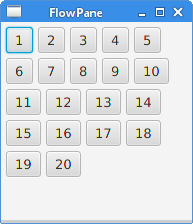
FlowPane
FlowPane 将节点放置在行或列中,当所有节点都无法显示时,这些节点会换行。Flow pane 的默认方向是水平的。FlowPane 的使用非常有限。
package com.zetcode;

import javafx.application.Application;
import javafx.geometry.Insets;
import javafx.geometry.Orientation;
import javafx.scene.Scene;
import javafx.scene.control.Button;
import javafx.scene.layout.FlowPane;
import javafx.stage.Stage;


public class FlowPaneEx extends Application {

    @Override
    public void start(Stage stage) {

        initUI(stage);
    }

    private void initUI(Stage stage) {

        FlowPane root = new FlowPane(Orientation.HORIZONTAL, 5, 5);
        root.setPadding(new Insets(5));

        for (int i=1; i<=20; i++) {
            root.getChildren().add(new Button(String.valueOf(i)));
        }

        Scene scene = new Scene(root, 300, 250);

        stage.setTitle("FlowPane");
        stage.setScene(scene);
        stage.show();
    }

    public static void main(String[] args) {
        launch(args);
    }
}
在本例中,我们将二十个按钮放置在 FlowPane 中。如果它们不能全部显示在一行中,则按钮会换行到其他行中。
FlowPane root = new FlowPane(Orientation.HORIZONTAL, 5, 5);
创建了一个水平的 FlowPane。第二个和第三个参数指定面板中节点之间的水平和垂直间隙。
root.setPadding(new Insets(5));
setPadding 方法在面板周围设置一些空间。
for (int i=1; i<=20; i++) {
    root.getChildren().add(new Button(String.valueOf(i)));
}
将二十个按钮添加到 flow pane。按钮显示整数值。
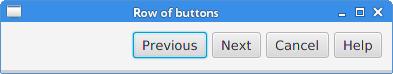
HBox
HBox 将其子节点布局在单个水平行中。此面板与其他布局管理器配合使用以创建布局。它适用于进行基本布局。
package com.zetcode;

import javafx.application.Application;
import javafx.geometry.Insets;
import javafx.geometry.Pos;
import javafx.scene.Scene;
import javafx.scene.control.Button;
import javafx.scene.layout.HBox;
import javafx.stage.Stage;


public class RowOfButtonsEx extends Application {

    @Override
    public void start(Stage stage) {

        initUI(stage);
    }

    private void initUI(Stage stage) {

        HBox root = new HBox(5);
        root.setPadding(new Insets(10));
        root.setAlignment(Pos.BASELINE_RIGHT);

        Button prevBtn = new Button("Previous");
        Button nextBtn = new Button("Next");
        Button cancBtn = new Button("Cancel");
        Button helpBtn = new Button("Help");

        root.getChildren().addAll(prevBtn, nextBtn, cancBtn, helpBtn);

        Scene scene = new Scene(root);
        stage.setTitle("Row of buttons");
        stage.setScene(scene);
        stage.show();
    }

    public static void main(String[] args) {
        launch(args);
    }
}
该示例在单行中显示四个按钮。该行是右对齐的。按钮之间有一些空间。
HBox root = new HBox(5);
创建了一个带有间距的 HBox 面板。
root.setPadding(new Insets(10));
我们在 HBox 周围创建了一些填充
root.setAlignment(Pos.BASELINE_RIGHT);
setAlignment 方法将节点右对齐。
root.getChildren().addAll(prevBtn, nextBtn, cancBtn, helpBtn);
按钮添加到容器中。
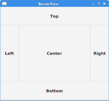
BorderPane
BorderPane 将子节点布局在顶部、左侧、右侧、底部和中心位置。它可用于创建经典外观的应用程序布局。
package com.zetcode;

import javafx.application.Application;
import javafx.geometry.Pos;
import javafx.scene.Scene;
import javafx.scene.control.Label;
import javafx.scene.layout.BorderPane;
import javafx.stage.Stage;


class MyLabel extends Label {

    public MyLabel(String text) {
        super(text);

        setAlignment(Pos.BASELINE_CENTER);
    }
}

public class BorderPaneEx extends Application {

    private BorderPane root;
    private final int SIZE = 60;

    @Override
    public void start(Stage stage) {

        initUI(stage);
    }

    private void initUI(Stage stage) {

        root = new BorderPane();

        root.setTop(getTopLabel());
        root.setBottom(getBottomLabel());
        root.setLeft(getLeftLabel());
        root.setRight(getRightLabel());
        root.setCenter(getCenterLabel());

        Scene scene = new Scene(root, 350, 300);

        stage.setTitle("BorderPane");
        stage.setScene(scene);
        stage.show();
    }

    private Label getTopLabel() {

        Label lbl = new MyLabel("Top");
        lbl.setPrefHeight(SIZE);
        lbl.prefWidthProperty().bind(root.widthProperty());
        lbl.setStyle("-fx-border-style: dotted; -fx-border-width: 0 0 1 0;"
                + "-fx-border-color: gray; -fx-font-weight: bold");

        return lbl;
    }

    private Label getBottomLabel() {

        Label lbl = new MyLabel("Bottom");
        lbl.setPrefHeight(SIZE);
        lbl.prefWidthProperty().bind(root.widthProperty());
        lbl.setStyle("-fx-border-style: dotted; -fx-border-width: 1 0 0 0;"
                + "-fx-border-color: gray; -fx-font-weight: bold");

        return lbl;
    }

    private Label getLeftLabel() {

        Label lbl = new MyLabel("Left");
        lbl.setPrefWidth(SIZE);
        lbl.prefHeightProperty().bind(root.heightProperty().subtract(2*SIZE));
        lbl.setStyle("-fx-border-style: dotted; -fx-border-width: 0 1 0 0;"
                + "-fx-border-color: gray; -fx-font-weight: bold");

        return lbl;
    }


    private Label getRightLabel() {

        Label lbl = new MyLabel("Right");
        lbl.setPrefWidth(SIZE);
        lbl.prefHeightProperty().bind(root.heightProperty().subtract(2*SIZE));
        lbl.setStyle("-fx-border-style: dotted; -fx-border-width: 0 0 0 1;"
                + "-fx-border-color: gray; -fx-font-weight: bold");

        return lbl;
    }

    private Label getCenterLabel() {

        Label lbl = new MyLabel("Center");
        lbl.setStyle("-fx-font-weight: bold");
        lbl.prefHeightProperty().bind(root.heightProperty().subtract(2*SIZE));
        lbl.prefWidthProperty().bind(root.widthProperty().subtract(2*SIZE));

        return lbl;
    }

    public static void main(String[] args) {
        launch(args);
    }
}
该示例将五个标签放置在五个 BorderPane 的区域中。
root.setTop(getTopLabel());
root.setBottom(getBottomLabel());
root.setLeft(getLeftLabel());
root.setRight(getRightLabel());
root.setCenter(getCenterLabel());
使用 setTop、setBottom、setLeft、setRight 和 setCenter 方法定位节点。
Label lbl = new MyLabel("Top");
lbl.setPrefHeight(SIZE);
在这里,我们使用 setPrefHeight 方法增加了顶部标签的首选高度。首选高度是标签最初显示的高度。
lbl.prefWidthProperty().bind(root.widthProperty());
BorderPane 遵循其子节点的首选大小。对于标签,它是一个足够大的大小以显示其文本。我们将标签的首选宽度属性绑定到面板的相应属性。这样标签从面板的左侧扩大到右侧。
lbl.setStyle("-fx-border-style: dotted; -fx-border-width: 0 0 1 0;"
        + "-fx-border-color: gray; -fx-font-weight: bold");
我们更改标签的样式,以便清楚地看到其边界。
AnchorPane
AnchorPane 将子节点的边缘锚定到与锚定面板边缘的偏移量。如果锚定面板设置了边框或填充,则偏移量将从这些插图的内边缘测量。AnchorPane 是一个简单的布局面板,必须与其他布局面板一起使用才能创建有意义的布局。
package com.zetcode;

import javafx.application.Application;
import javafx.scene.Scene;
import javafx.scene.control.Button;
import javafx.scene.layout.AnchorPane;
import javafx.scene.layout.HBox;
import javafx.stage.Stage;


public class CornerButtonsEx extends Application {

    @Override
    public void start(Stage stage) {

        initUI(stage);
    }

    private void initUI(Stage stage) {

        AnchorPane root = new AnchorPane();

        Button okBtn = new Button("OK");
        Button closeBtn = new Button("Close");
        HBox hbox = new HBox(5, okBtn, closeBtn);

        root.getChildren().addAll(hbox);

        AnchorPane.setRightAnchor(hbox, 10d);
        AnchorPane.setBottomAnchor(hbox, 10d);

        Scene scene = new Scene(root, 300, 200);

        stage.setTitle("Corner buttons");
        stage.setScene(scene);
        stage.show();
    }

    public static void main(String[] args) {
        launch(args);
    }
}
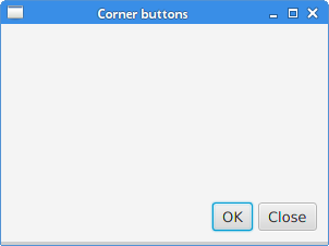
该示例使用 AnchorPane 和 HBox 将两个按钮定位到窗口的右下角。
AnchorPane root = new AnchorPane();
AnchorPane 是场景图的根节点。
Button okBtn = new Button("OK");
Button closeBtn = new Button("Close");
HBox hbox = new HBox(5, okBtn, closeBtn);
这两个按钮放置在 HBox 中。我们使用一个直接放置按钮对象的构造函数。
root.getChildren().addAll(hbox);
hbox 添加到锚定面板。
AnchorPane.setRightAnchor(hbox, 10d);
setRightAnchor 方法将 hbox 锚定到面板的右边缘。第二个参数提供与边缘的偏移量。
AnchorPane.setBottomAnchor(hbox, 10d);
setBottomAnchor 方法将 hbox 锚定到面板的底部边缘。
GridPane
GridPane 将其节点放置在行和列的网格中。节点可以跨越多个行或列。GridPane 是最灵活的内置布局面板。
setGridLinesVisible 启用显示布局网格的线条,这使我们能够直观地调试布局。
package com.zetcode;

import javafx.application.Application;
import javafx.geometry.HPos;
import javafx.geometry.Insets;
import javafx.scene.Scene;
import javafx.scene.control.Button;
import javafx.scene.control.Label;
import javafx.scene.control.ListView;
import javafx.scene.control.TextField;
import javafx.scene.layout.ColumnConstraints;
import javafx.scene.layout.GridPane;
import javafx.scene.layout.Priority;
import javafx.scene.layout.RowConstraints;
import javafx.stage.Stage;


public class NewFolderEx extends Application {

    @Override
    public void start(Stage stage) {

        initUI(stage);
    }

    private void initUI(Stage stage) {

        GridPane root = new GridPane();
        root.setHgap(8);
        root.setVgap(8);
        root.setPadding(new Insets(5));

        ColumnConstraints cons1 = new ColumnConstraints();
        cons1.setHgrow(Priority.NEVER);
        root.getColumnConstraints().add(cons1);

        ColumnConstraints cons2 = new ColumnConstraints();
        cons2.setHgrow(Priority.ALWAYS);

        root.getColumnConstraints().addAll(cons1, cons2);

        RowConstraints rcons1 = new RowConstraints();
        rcons1.setVgrow(Priority.NEVER);

        RowConstraints rcons2 = new RowConstraints();
        rcons2.setVgrow(Priority.ALWAYS);

        root.getRowConstraints().addAll(rcons1, rcons2);

        Label lbl = new Label("Name:");
        TextField field = new TextField();
        ListView view = new ListView();
        Button okBtn = new Button("OK");
        Button closeBtn = new Button("Close");

        GridPane.setHalignment(okBtn, HPos.RIGHT);

        root.add(lbl, 0, 0);
        root.add(field, 1, 0, 3, 1);
        root.add(view, 0, 1, 4, 2);
        root.add(okBtn, 2, 3);
        root.add(closeBtn, 3, 3);

        Scene scene = new Scene(root, 280, 300);

        stage.setTitle("New folder");
        stage.setScene(scene);
        stage.show();
    }

    public static void main(String[] args) {
        launch(args);
    }
}
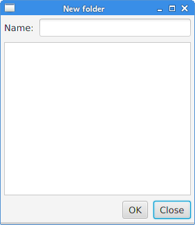
此示例的布局由一个标签、一个文本字段、一个列表视图和两个按钮组成。
GridPane root = new GridPane();
创建了一个 GridPane 的实例。
root.setHgap(8);
root.setVgap(8);
这两个方法在节点之间创建水平和垂直间隙。
ColumnConstraints cons1 = new ColumnConstraints();
cons1.setHgrow(Priority.NEVER);
root.getColumnConstraints().add(cons1);

ColumnConstraints cons2 = new ColumnConstraints();
cons2.setHgrow(Priority.ALWAYS);

root.getColumnConstraints().addAll(cons1, cons2);
在布局中,我们需要使第二列可增长。默认情况下,网格面板以其首选大小显示其子节点,并且在窗口增大时不会扩大它们。我们创建列约束,在其中将水平增长优先级设置为第二列的 Priority.ALWAYS。(没有专门的方法可以做到这一点。)最后,这使得文本字段和列表视图控件在水平方向上随着窗口的增大而增长。
RowConstraints rcons1 = new RowConstraints();
rcons1.setVgrow(Priority.NEVER);

RowConstraints rcons2 = new RowConstraints();
rcons2.setVgrow(Priority.ALWAYS);

root.getRowConstraints().addAll(rcons1, rcons2);
以类似的方式,我们使第二行可增长。通过使第二列和第二行可增长,列表视图在两个方向上都增长,占据了大部分客户端区域。
Label lbl = new Label("Name:");
TextField field = new TextField();
ListView view = new ListView();
Button okBtn = new Button("OK");
Button closeBtn = new Button("Close");
创建了五个控件。
GridPane.setHalignment(okBtn, HPos.RIGHT);
setHalignment 方法使 okBtn 右对齐。
root.add(lbl, 0, 0);
标签控件添加到网格。add 方法的前两个参数是列和行索引。索引从零开始。
root.add(field, 1, 0, 3, 1);
重载的 add 方法还指定了列和行跨度。文本字段转到第二列和第一行。它跨越三列和一行。
MigPane
MigPane 是一个非常强大的第三方布局管理器。它使用 MigLayout 管理器,该管理器可用于 Swing、SWT 和 JavaFX。强烈建议考虑使用此管理器。
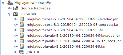
要使用 MigPane,需要将 JAR 包含到项目库中。源和 javadoc 的 JAR 是可选的。
MigPane 使用字符串约束来执行布局。有四种约束:通用约束、列约束、行约束和控件约束。MigPane 中有几种布局模式。网格模式是默认模式,也是可用的最灵活的模式。
package com.zetcode;

import javafx.application.Application;
import javafx.scene.Scene;
import javafx.scene.control.Button;
import javafx.scene.control.Control;
import javafx.scene.control.Label;
import javafx.scene.control.ListView;
import javafx.stage.Stage;
import org.tbee.javafx.scene.layout.MigPane;


public class MigLayoutWindowsEx extends Application {

    MigPane root;

    @Override
    public void start(Stage stage) {

        initUI(stage);
    }

    private void initUI(Stage stage) {

        root = new MigPane("", "[grow][]", "[][][grow][]");
        Scene scene = new Scene(root);

        Label lbl = new Label("Windows");
        Button actBtn = new Button("Activate");
        Button closeBtn = new Button("Close");
        Button okBtn = new Button("OK");
        Button helpBtn = new Button("Help");
        ListView listView = new ListView();

        createLayout(lbl, listView, actBtn, closeBtn, helpBtn, okBtn);

        stage.setTitle("Windows");
        stage.setScene(scene);
        stage.show();
    }

    private void createLayout(Control...arg) {

        root.add(arg[0], "wrap");
        root.add(arg[1], "w 200, h 200, span 2 2, grow");
        root.add(arg[2], "wrap");
        root.add(arg[3], "top, wrap");
        root.add(arg[4]);
        root.add(arg[5], "skip");
    }

    public static void main(String[] args) {
        launch(args);
    }
}
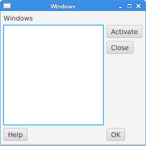
该示例使用六个控件、四个按钮、一个标签和一个列表视图。
root = new MigPane("", "[grow][]", "[][][grow][]");
MigPane 构造函数的三个字符串指定了通用、列和行约束。[grow][] 约束指定有两个列,并且第一列是可增长的。同样,[][][grow][] 约束告诉 MigPane 有四个行,第三行是可增长的。如果我们将 debug 约束放入通用约束中,我们可以直观地调试布局。
createLayout(lbl, listView, actBtn, closeBtn, helpBtn, okBtn);
布局的创建委托给 createLayout 方法。
root.add(arg[0], "wrap");
标签控件进入第一行和第一列。可以(但不是必需的)显式指定单元格索引。wrap 约束开始一个新行。
root.add(arg[1], "w 200, h 200, span 2 2, grow");
w 和 h 约束指定列表视图控件的初始宽度和高度。最佳实践是只有布局管理器设置其组件的大小。换句话说,直接在控件上调用类似 setMinSize 的方法不是一个好的实践。span 约束使控件跨越两列和两行。最后,grow 约束使控件在窗口调整大小时在两个方向上增长。
root.add(arg[2], "wrap");
第三个控件是“激活”按钮。它位于列表视图旁边。放置此控件后,我们开始一个新行。
root.add(arg[3], "top, wrap");
“关闭”按钮位于列表视图旁边,并在“激活”按钮下方。top 约束将按钮与单元格的顶部对齐。
root.add(arg[4]);
我们使列表视图跨越两行。将先前的按钮放置到两个单独的行中后,下一个按钮会自动位于列表视图下方。
root.add(arg[5], "skip");
最后一个按钮跳过一列。因此,它位于第三列和第四行。
在本 JavaFX 教程的这一部分中,我们提到了布局面板。