GTK# 中的 Widgets II
最后修改于 2023 年 10 月 18 日
在本 GTK# 编程教程中,我们将继续介绍 GTK# 的 widgets。
我们将介绍 Entry widget、Scale widget、ToggleButton 和 Calendar widget。
Entry(输入框)
Entry 是一个单行文本输入框。此 widget 用于输入文本数据。
using Gtk;
using System;

class SharpApp : Window {

    Label label;

    public SharpApp() : base("Entry")
    {
        SetDefaultSize(250, 200);
        SetPosition(WindowPosition.Center);
        BorderWidth = 7;
        DeleteEvent += delegate { Application.Quit(); };

        label = new Label("...");

        Entry entry = new Entry();
        entry.Changed += OnChanged;

        Fixed fix = new Fixed();
        fix.Put(entry, 60, 100);
        fix.Put(label, 60, 40);

        Add(fix);

        ShowAll();
    }

    void OnChanged(object sender, EventArgs args)
    {
        Entry entry = (Entry) sender;
        label.Text = entry.Text;
    }

    public static void Main()
    {
        Application.Init();
        new SharpApp();
        Application.Run();
    }
}
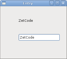
此示例展示了一个输入框和一个标签。我们在输入框中键入的文本会立即显示在标签控件中。
Entry entry = new Entry();
创建 Entry widget。
entry.Changed += OnChanged;
如果 Entry widget 中的文本发生更改,我们将调用 OnChanged 方法。
void OnChanged(object sender, EventArgs args)
{
    Entry entry = (Entry) sender;
    label.Text = entry.Text;
}
我们从 Entry widget 获取文本并将其设置为标签。
Scale(滑块)
Scale 是一个 widget,允许用户通过在有界区间内滑动滑块来图形化地选择一个值。我们的示例将展示一个音量控制。
using Gtk;
using System;

class SharpApp : Window {

    Gdk.Pixbuf mute, min, med, max;
    Image image;

    public SharpApp() : base("Scale")
    {
        SetDefaultSize(260, 150);
        SetPosition(WindowPosition.Center);
        DeleteEvent += delegate { Application.Quit(); };

        HScale scale = new HScale(0, 100, 1);
        scale.SetSizeRequest(160, 35);
        scale.ValueChanged += OnChanged;

        LoadPixbufs();

        image = new Image(mute);

        Fixed fix = new Fixed();
        fix.Put(scale, 20, 40);
        fix.Put(image, 219, 50);

        Add(fix);

        ShowAll();
    }

    void LoadPixbufs()
    {
        try {
            mute = new Gdk.Pixbuf("mute.png");
            min = new Gdk.Pixbuf("min.png");
            med = new Gdk.Pixbuf("med.png");
            max = new Gdk.Pixbuf("max.png");
        } catch {
            Console.WriteLine("Error reading Pixbufs");
            Environment.Exit(1);
        }
    }

    void OnChanged(object obj, EventArgs args)
    {
        HScale scale = (HScale) obj;
        double val = scale.Value;

        if (val == 0) {
            image.Pixbuf = mute;
        } else if (val > 0 && val < 30) {
            image.Pixbuf = min;
        } else if (val > 30 && val < 80) {
            image.Pixbuf = med;
        } else {
            image.Pixbuf = max;
        }
    }

    public static void Main()
    {
        Application.Init();
        new SharpApp();
        Application.Run();
    }
}
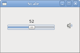
在上面的例子中,我们有 HScale 和 Image widgets。通过拖动滑块,我们可以更改 Image widget 上的图像。
HScale scale = new HScale(0, 100, 1);
创建 HScale widget。参数为下限、上限和步长。
HScale scale = (HScale) obj;
double val = scale.Value;
在 OnChange 方法中,我们获取滑块 widget 的值。
if (val == 0) {
    image.Pixbuf = mute;
} else if (val > 0 && val <= 30) {
    image.Pixbuf = min;
} else if (val > 30 && val < 80) {
    image.Pixbuf = med;
} else {
image.Pixbuf = max;
}
根据获取的值,我们更改图像 widget 中的图片。
ToggleButton
ToggleButton 是一个具有两种状态的按钮:按下和未按下。您可以通过单击它在这两种状态之间切换。在某些情况下,此功能非常适用。
using Gtk;
using System;

class SharpApp : Window {

    DrawingArea darea;
    Gdk.Color col;

    public SharpApp() : base("ToggleButtons")
    {
        col = new Gdk.Color(0, 0, 0);

        SetDefaultSize(350, 240);
        SetPosition(WindowPosition.Center);
        BorderWidth = 7;
        DeleteEvent += delegate { Application.Quit(); };

        ToggleButton red = new ToggleButton("Red");
        red.SetSizeRequest(80, 35);
        red.Clicked += OnRed;

        ToggleButton green = new ToggleButton("Green");
        green.SetSizeRequest(80, 35);
        green.Clicked += OnGreen;

        ToggleButton blue = new ToggleButton("Blue");
        blue.SetSizeRequest(80, 35);
        blue.Clicked += OnBlue;

        darea = new DrawingArea();
        darea.SetSizeRequest(150, 150);
        darea.ModifyBg(StateType.Normal, col);

        Fixed fix = new Fixed();
        fix.Put(red, 30, 30);
        fix.Put(green, 30, 80);
        fix.Put(blue, 30, 130);
        fix.Put(darea, 150, 30);

        Add(fix);

        ShowAll();
    }

    void OnRed(object sender, EventArgs args)
    {
        ToggleButton tb = (ToggleButton) sender;

        if (tb.Active) {
            col.Red = 65535;
        } else {
            col.Red = 0;
        }

        darea.ModifyBg(StateType.Normal, col);
    }

    void OnGreen(object sender, EventArgs args)
    {
        ToggleButton tb = (ToggleButton) sender;

        if (tb.Active) {
            col.Green = 65535;
        } else {
            col.Green = 0;
        }

        darea.ModifyBg(StateType.Normal, col);
    }

    void OnBlue(object sender, EventArgs args)
    {
        ToggleButton tb = (ToggleButton) sender;

        if (tb.Active) {
            col.Blue = 65535;
        } else {
            col.Blue = 0;
        }

        darea.ModifyBg(StateType.Normal, col);
    }

    public static void Main()
    {
        Application.Init();
        new SharpApp();
        Application.Run();
    }
}
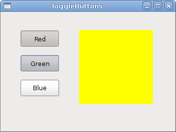
在我们的示例中,我们展示了三个切换按钮和一个 DrawingArea。我们将该区域的背景颜色设置为黑色。切换按钮将切换颜色值的红色、绿色和蓝色部分。背景颜色将取决于我们按下了哪些切换按钮。
col = new Gdk.Color(0, 0, 0);
这是将使用切换按钮更新的颜色值。
ToggleButton red = new ToggleButton("Red");
red.SetSizeRequest(80, 35);
red.Clicked += OnRed;
创建 ToggleButton widget。我们将它的大小设置为 80x35 像素。每个切换按钮都有自己的处理方法。
darea = new DrawingArea();
darea.SetSizeRequest(150, 150);
darea.ModifyBg(StateType.Normal, col);
DrawingArea widget 是显示由切换按钮混合的颜色的 widget。开始时,它显示黑色。
if (tb.Active) {
    col.Red = 65535;
} else {
    col.Red = 0;
}
我们根据 Active 属性的值更新颜色的红色部分。
darea.ModifyBg(StateType.Normal, col);
我们更新 DrawingArea widget 的颜色。
Calendar(日历)
我们的最后一个 widget 是 Calendar widget。它用于处理日期。
using Gtk;
using System;

class SharpApp : Window {

    private Label label;

    public SharpApp() : base("Calendar")
    {
        SetDefaultSize(300, 270);
        SetPosition(WindowPosition.Center);
        DeleteEvent += delegate { Application.Quit(); };

        label = new Label("...");

        Calendar calendar = new Calendar();
        calendar.DaySelected += OnDaySelected;

        Fixed fix = new Fixed();
        fix.Put(calendar, 20, 20);
        fix.Put(label, 40, 230);

        Add(fix);

        ShowAll();
    }

    void OnDaySelected(object sender, EventArgs args)
    {
        Calendar cal = (Calendar) sender;
        label.Text = cal.Month + 1 + "/" + cal.Day + "/" + cal.Year;
    }

    public static void Main()
    {
        Application.Init();
        new SharpApp();
        Application.Run();
    }
}
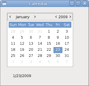
我们有 Calendar widget 和一个 Label。从日历中选择的日期显示在标签中。
Calendar calendar = new Calendar();
创建 Calendar widget。
Calendar cal = (Calendar) sender;
label.Text = cal.Month + 1 + "/" + cal.Day + "/" + cal.Year;
在 OnDaySelected 方法中,我们获取对 Calendar widget 的引用,并将标签更新为当前选择的日期。
在本章中,我们完成了关于 GTK# widgets 的讨论。